Catghost
Administrator
|
 Posted: Thu Feb 18, 2010 9:38 pm Posted: Thu Feb 18, 2010 9:38 pm
|

|
|
|
| As some of you have noticed, Midorea has a new layout. We have gone back to the original Blue/Green colors, but as you can see these colors are very desaturated.
Some new things you might have noticed is the "About Me" section for profiles and the Battle Navigation.
The battle navigation is only located on pages related to the battle system. (character/temple/forge etc.)
Press F5 or clear your cache so that the new images will show up.
If you have any suggestions, find a bug or have any questions please post them here.
Thanks and we hope everyone likes the new layout!
| |
|
|
|
|
|
|

|
Weaseldale
Moderator

|
|
Posted: Thu Feb 18, 2010 9:41 pm
|
|
|
|
| -has already declared love for it-
The only bug I found doesn't exist anymore; it's all good so far.
Except for how difficult it is to read yellow font sometimes, that is. xD
Edit- Whenever you click 'head to battle arena' you go to -link removed-. It does weird things to the avatars if you don't notice the 'test' part.
| |
|
|
|
_________________
I am Lady Sprinkles.
Uni has swallowed me whole, in more ways than one, sorry guys. Feel free to PM any questions (or nonquestions {or anything else, no limits here}) you have, although I don't know when I'll get to them since I'm barely on atm. |
|
|
|
|
|
Venri
|
|
Posted: Thu Feb 18, 2010 10:47 pm
|
|
|
|
| First off, I love the new design and colours!
Though up top where all the info is like how much gold and silver you have and such, the light blue text is really hard to read against the light green. That's all I can think of =)
| |
|
|
|
|
|
|
|
|
Catghost
Administrator
|
|
Posted: Thu Feb 18, 2010 10:54 pm
|
|
|
|
| Light blue? The text shows up as dark green to me. Try pressing F5 and see if that works. =3
[edit] Thanks Weaseldale! That should be fixed now...
| |
|
|
|
|
|
|
|
|
Overlord Branny
|
|
Posted: Thu Feb 18, 2010 10:58 pm
|
|
|
|
| Hmmm...not bad not bad..
The new see through look will take some time to get used to but its pretty good! ^_^;
The banner art doesn't match now though...or something...idk
Good work though!
| |
|
|
|
_________________
 |
|
|
|
|
|
Venri
|
|
Posted: Thu Feb 18, 2010 10:59 pm
|
|
|
|
| Lol no wit's showing up as a whitish colour, I just think my comp is spazzing right now maybe? But anyways, thanks for the awesome new design =)
| |
|
|
|
|
|
|
|
|
Catghost
Administrator
|
|
Posted: Thu Feb 18, 2010 11:03 pm
|
|
|
|
|
| St. Branny wrote: |
Hmmm...not bad not bad..
The new see through look will take some time to get used to but its pretty good! ^_^;
The banner art doesn't match now though...or something...idk
Good work though! |
New header art will be added soon. <3 I just have to wait until the artist sends me the file.
Venri Yeah, it's probably because the stylesheet hasn't updated yet. F5 usually does the trick for me. ^_^
| |
|
|
|
|
|
|
|
|
Urboros
|
|
Posted: Fri Feb 19, 2010 9:00 am
|
|
|
|
| I love the new layout!
but I'm pretty easy to please. 
| |
|
|
|
_________________

 |
|
|
|
|
|
Catghost
Administrator
|
|
Posted: Fri Feb 19, 2010 11:06 am
|
|
|
|
| Press F5 to see the new header art. =)
| |
|
|
|
|
|
|
|
|
Maverik
|
|
Posted: Fri Feb 19, 2010 11:10 am
|
|
|
|
| It be so... Shiny. O.O
The site looks so spiffeh. ^^
| |
|
|
|
|
|
|
|
|
|
|
|
|
Neroki
|
|
Posted: Fri Feb 19, 2010 1:18 pm
|
|
|
|
| I think this is a good improvment for the site, and it seems also like a very good experiment for this communitiy to move forward. I did not find any technical problems with it which is always a good thing. This newer appeal looks more organized, with the almost bubbly layering tabs. However on my opinion I prefered the dropdown subtopics from the topics idea in the previous layout. Overall the layout is still very stunning and eyecatching. One of the things I adore about Midorea is how above and beyond the team has gone for this degree of professionalism. I hope this feedback and others will help the team to improve and reach their vision for this fantastic communitiy. .gif)
| |
|
|
|
|
|
|
|
|
x_lilmissNINJA_x
|
|
Posted: Fri Feb 19, 2010 1:43 pm
|
|
|
|
| I love it!
And the posts in the forum don't get the bottoms cut off anymore, which is an amazing improvement!
| |
|
|
|
_________________
I'm currently a college butthead so I'm now super preoccupied trying not to be a loser please bear with me. |
|
|
|
|
|
kaishi
Artist

|
|
Posted: Fri Feb 19, 2010 2:29 pm
|
|
|
|
| I really like the new layout... naturally because it's still my favorite colors XD;;
| |
|
|
|
|
|
|
|
|
WhiteRiver
|
|
Posted: Fri Feb 19, 2010 3:46 pm
|
|
|
|
| I love how this layout looks! I haven't gone around clicking yet to see if everything works, so I can't comment on that.
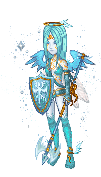
The colours are amazing, the header makes it look like my avatar is actually standing on the ground in that scene, I love how it does that too, and I especially like how the tabs and default info are organised now. Lovely art and lovely colours. *floats*
| |
|
|
|
|
|
|
|
|