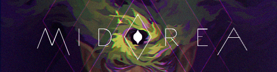
| Would you like the colors of Midorea to change to look more like the index art? |
| Yes |
|
83% |
[ 96 ] |
| No |
|
16% |
[ 19 ] |
|
| Total Votes : 115 |
|
Catghost
Administrator
|
 Posted: Sat Jul 25, 2009 11:21 am Posted: Sat Jul 25, 2009 11:21 am
|

|
|
|

|
Lucifer
|
|
Posted: Sat Jul 25, 2009 11:47 am
|
|
|
|
| I think it would look better, so I vote yes 
| |
|
|
|
|
|
|
|
|
Chu
Assistant Admin
|
|
Posted: Sat Jul 25, 2009 1:06 pm
|
|
|
|
| I have to say I'll really miss the lime green if this happens, but I think that the layout would definitely be more appealing to people if it's changed. ^_^ It would also be a lot more calming.
| |
|
|
|
_________________
Add me on Skype! I'm ewitsChu. Even if we've never talked, just tell me your username in the friend request and I'll accept.
 |
|
|
|
|
|
Gladde
|
|
Posted: Sat Jul 25, 2009 10:19 pm
|
|
|
|
| I think that although the bright colors are nice, the color template that you have in your post is a lot better. They are more pleasing to the eyes, whereas the ones that are being used right now kind of hurt my eyes.
| |
|
|
|
_________________
My Quest
My Shop : Currently selling, Event Items, and Commons [Updated: 10/18/10] |
|
|
|
|
|
Freshie
Moderator

|
|
Posted: Sat Jul 25, 2009 11:20 pm
|
|
|
|
| I think those are lovely colors and I'd love to see them on the site..so yes? ^^
Plus, they're the best colors that look good on me (in real life), blues, greens and browns.
Why didn't I figure that out before? xD
The art is awesome sauce also of course. <3
| |
|
|
|
_________________
I am a Global Moderator. Have any questions, comments, or concerns? Feel free to PM me.
"Please stand clear of the doors. Por favor manténganse alejado de las puertas."
Disneyland was fun! :D
 |
|
|
|
|
|
glimpse
|
|
Posted: Sun Jul 26, 2009 12:06 am
|
|
|
|
| I think it'd look better on the site, definitely! I think the layout revamp is AWESOME at the moment, but it would look even better with the colors you suggested. And I'm curious at what changes you would make. :3
So I'm voting yes~
| |
|
|
|
_________________
ILU MEL
Wondering why I'm
NAKED???

Check back after the event for
The First Ever Naked Day Celebration! |
|
|
|
|
|
kaishi
Artist

|
|
Posted: Sun Jul 26, 2009 12:58 am
|
|
|
|
| I have to say that although I am a fan of the current layout, I LOVE your proposed color palette (Mido is already my favorite colors anyway lol). I think it would please a lot of people who have trouble with the bright colors. And really, when everything is saturated like it is now, it's hard to make anything stand out. The lighter colors might be a little more versatile. Who knows?
Admittedly, I am a little sad that you might be changing these colors so soon after implementing them. All for the greater good, I suppose.
Midorea is going to start looking like a part of my bedroom soon. I should get some bright green curtains or something, then I'd be set. XD
| |
|
|
|
|
|
|
|
|
LOL UR FACE
|
|
Posted: Sun Jul 26, 2009 2:29 pm
|
|
|
|
| You guys do realize that in that layout the ONLY color in the current layout that will go away is the only dark one right? The bright greens and blues will never go away as they are Midorea's colors.
Chu compared them best in saying the possibly new layout will be "beachy" while the current layout is "earthy." I don't know if that will help any of you envision it better but it's a good description.
For me having beige be the dominant color looks very bland. In the index art there is a good balance of all the colors, but it is hard to have such a balance in a layout, there's usually one dominant color. Think of the current layout and replace the dark brown with beige in your mind.
| |
|
|
|
_________________

BE MIZ. BE AWESOME. |
|
|
|
|
|
Catghost
Administrator
|
|
Posted: Sun Jul 26, 2009 3:54 pm
|
|
|
|
| It would be more like replacing the current green with beige & light beige, brown with teal(second darkest blue) and the current blue with turquoise(lightest blue). 
And the brown in the background with the darkest blue.
Also the green will be used for the links, borders and other things.
I'll post up a mock-up of the new layout with new colors later on today.
| |
|
|
|
|
|
|
|
|
Megan
|
|
Posted: Sun Jul 26, 2009 4:12 pm
|
|
|
|
| I voted yes. I think it'd be nice.
I'm not a huge fan of the beige, but I still think whatever you guys decide to do that it'll look wonderful.
| |
|
|
|
_________________
Can't stop, Won't stop. |
|
|
|
|
|
Miyani-chan
|
|
Posted: Sun Jul 26, 2009 11:25 pm
|
|
|
|
| Ooh, the color palette looks very nice. <3
I voted yes~! The color is really soothing to me. = w=
| |
|
|
|
|
|
|
|
|
Squid
|
|
Posted: Tue Jul 28, 2009 10:04 am
|
|
|
|
| Hmm. I really enjoy the current layout colors.
But it's difficult to say without seeing it in those colors, you know? Even though, personally, I think that might be a bit bright. And I know this layout isn't entirely dark, what with the neon green, but the dark brown is really nice, and if they layout where beige... and light beige... Eek. It seems like it might be a bit bright to me.
(BEAUTIFUL ART THERE!)
| |
|
|
|
|
|
|
|
|
heyy13
|
|
Posted: Wed Aug 05, 2009 4:25 am
|
|
|
|
| Sorry to say this cat, but the site colours are kinda a mess at the moment. (the random browns the most), so i think it would be a vast improvment!
I vote to go back too the winter event layout. That was great and never hurt to look at. xD;;
| |
|
|
|
_________________

By Kaishi who is just the love. Seriously. <3 |
|
|
|
|
|
MelancholyMelody~
|
|
Posted: Wed Aug 05, 2009 8:50 pm
|
|
|
|
| Oh it's gorgeous. Yes, I'd like that.
I'm cool with it either way really. I'm not fusseh. :3
| |
|
|
|
_________________
Hey guys, as you may have noticed I'm currently not too active due to busyness, however if you need anything or just wanna drop me a line feel free to PM me, as when I check back I'm more likely to see it than posts. :3
iluglimpse  |
|
|
|
|
|
Raven-Hollow
|
|
Posted: Sun Aug 16, 2009 10:08 pm
|
|
|
|
| I like the new index and I think the color change would only be for the best. <3
| |
|
|
|
|
|
|
|
|
|
|
|
|