Catghost
Administrator
|
 Posted: Tue Oct 13, 2009 6:03 pm Posted: Tue Oct 13, 2009 6:03 pm
|

|
|
|
|
| Angel wrote: |
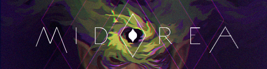
My favorite is the awesomely awesome art on the footer. Who made it? :O |
Aquarius-Chan made it. ^^
| |
|
|
|
|
|
|

|
DistortedBrwain
|
|
Posted: Tue Oct 13, 2009 6:40 pm
|
|
|
|
| I absolutely love the new layout. =D And I really really love the character at the bottom of the page! It is so pretty and mystic.
I also am very pleased with the new bases, they look even better now, absolutely adore the faces and eyes!
| |
|
|
|
|
|
|
|
|
Chere and Rose
|
|
Posted: Tue Oct 13, 2009 6:48 pm
|
|
|
|
| I LURVE the new base and layout Cat!
Thanks for all the updates and for keeping this site running!
Midorea!!!!
| |
|
|
|
_________________
*insert something witty here*
Boredom Chat <<Page Contest
|
|
|
|
|
|
Ehcuag Emmef
|
|
Posted: Tue Oct 13, 2009 9:09 pm
|
|
|
|
| Love the new layout! It's gorgeous. And the avatar page works in Safari 4 as well <3.
| |
|
|
|
_________________
Don't bother me. I'm listening to Green Day. Come chat with me? |
|
|
|
|
|
|
|
|
|
Chu
Assistant Admin
|
|
Posted: Tue Oct 13, 2009 10:37 pm
|
|
|
|
|
| Maeve wrote: |
Uh, I just noticed the "Back to Top" thing is gone under our avatar picture (the thing that brings you back to the top of the thread). I just thought it might be nice to have it back, or get links to the forums at the bottom of the threads too (just like the ones at the top saying like "Midorea Forum Index -> etc..."), 'cause it's kinda boring to scroll back up each time you want to go back to the forums...
Edit: And the shops layout is awesome!  The only thing I would say is that the item's names don't show, which can be a bit confusing when the said items don't have picture (like in this screenshot). Except for that, it's great! The only thing I would say is that the item's names don't show, which can be a bit confusing when the said items don't have picture (like in this screenshot). Except for that, it's great! |
I agree with both of these, and I think I just found a solution to the second issue.
We have tooltips that display the item names in our inventories; is this possible to do in the shops?
| |
|
|
|
_________________
Add me on Skype! I'm ewitsChu. Even if we've never talked, just tell me your username in the friend request and I'll accept.
 |
|
|
|
|
|
Squid
|
|
Posted: Wed Oct 14, 2009 11:41 am
|
|
|
|
| I think that the new layout is REALLY AWESOME. Especially the part where the avatar page works in Chrome. It was such a hassle to open up Mozilla every time I wanted to change lol
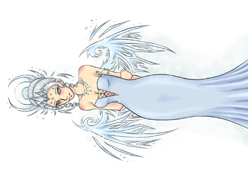
One thing that kind of hurts my feelings is the lack of pretty art on the home page. Used to be the pretty blue-glow girl? She's gone :c I miss her.
| |
|
|
|
|
|
|
|
|
Catghost
Administrator
|
|
Posted: Wed Oct 14, 2009 11:43 am
|
|
|
|
| She'll be back soon! c: The current home page is temporary. 
And also I meant to add item names to the shops but I forgot. >__< I'll see about adding them today.
| |
|
|
|
|
|
|
|
|
Berlin
|
|
Posted: Wed Oct 14, 2009 12:13 pm
|
|
|
|
| I am really loving the new layout. Sure the bright greens and blues were fun, but I really think that these colors better suit the forums' attitude. Also tans/browns with turquoise is probably one of my most favorite color combinations.
What I am most curious about is the new "explore" tab up on the header. Can't wait to see what that is all about. I hope it adds in more about the races. I've really been wanting to see them come more into play. 
| |
|
|
|
|
|
|
|
|
Chu
Assistant Admin
|
|
Posted: Wed Oct 14, 2009 12:54 pm
|
|
|
|
|
| Berlin wrote: |
I am really loving the new layout. Sure the bright greens and blues were fun, but I really think that these colors better suit the forums' attitude. Also tans/browns with turquoise is probably one of my most favorite color combinations.
What I am most curious about is the new "explore" tab up on the header. Can't wait to see what that is all about. I hope it adds in more about the races. I've really been wanting to see them come more into play. |
;D Let's just say that we're working some big things out with Midorea's story. Hopefully you'll all be able to experience it in a fun way soon.
| |
|
|
|
_________________
Add me on Skype! I'm ewitsChu. Even if we've never talked, just tell me your username in the friend request and I'll accept.
|
|
|
|
|
|
Catghost
Administrator
|
|
Posted: Wed Oct 14, 2009 2:50 pm
|
|
|
|
|
| Gladde wrote: |
I love the new layout.
The colors, the set up. Wonderfully done ^^
I think the only thing that is bothering me is the bar just below the avatar and header. The large words seem kind of cramped in the space that they are using. Maybe open it up or set them apart from the bar? |
Actually they are suppose to be like that. ^_^; But I'll see if I can do anything about it.
| Maeve wrote: |
Uh, I just noticed the "Back to Top" thing is gone under our avatar picture (the thing that brings you back to the top of the thread). I just thought it might be nice to have it back, or get links to the forums at the bottom of the threads too (just like the ones at the top saying like "Midorea Forum Index -> etc..."), 'cause it's kinda boring to scroll back up each time you want to go back to the forums...
Edit: And the shops layout is awesome! The only thing I would say is that the item's names don't show, which can be a bit confusing when the said items don't have picture (like in this screenshot). Except for that, it's great! |
Oh. I didn't know anyone used that. I'll see about putting one at the bottom of the page. ^^
| Kira Bella wrote: |
| Only thing I have to complain about is the 1/4th of an inch of black on the tops of some of the posts. Other then that I think the site looks wonderful! I am very happy with how it turned out. I think it just gives it a grown up feeling and such. Oh I wish I had old screen shots now xD |
I think that is something to do with your browser? What type of browser do you use?
| Chu wrote: |
I have two miniscule suggestions for the layout:
The quote where the post goes could be made light beige, to make it pop better from everything else.
I don't know about anyone else, but I'd like to see a little more green. :] Even if only on some of the buttons or the dark blue boxes (like where you type your posts, but that would most likely be overkill). That may just be my fear of change though so don't think too hard on it. xP |
I went with dark beige because it was more calmer, I don't think the bright beige would look good with a dark brown background. But I'll test it out to see how it looks perhaps. ^_^
| |
|
|
|
|
|
|
|
|
Lunar
|
|
Posted: Wed Oct 14, 2009 2:57 pm
|
|
|
|
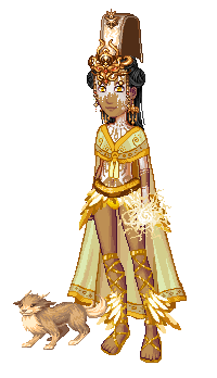
| <<; Why has no-one said anything about the bases... ...
Okay.. um.. prepare for a slight rant (SORRY!)
(Love the layout.. the beige hurts my eyes a little, but the footer is gorgeous.)
Bases: Firstly, the right hand.. I notice this is the main change? Um.. why?
If it is to hold items less awkwardly.. fair enough, but I feel this should be optional.. because it looks (Scuse my language) retarded like that.. its higher and looks.. really weird.. Prefer the old, tbh.
Male base: Um.. the guy has an 8 pack (Thats not humanly possible without steroids, and I dont presume the men of midorea all have the money for that.) Six pack.. fine, but that looks ridiculous.. and the arms- in the attempt to make them look muscular they just look lumpy. To make them muscular, you actually need to change the physical shape of the outline, not just shade them..
I really, honestly preferred the old bases... the new additions.. look ridiculous and badly thought out.
| |
|
|
|
_________________
 |
|
|
|
|
|
Catghost
Administrator
|
|
Posted: Wed Oct 14, 2009 3:15 pm
|
|
|
|
| But the right hand has not been touched. Unless you mean our right?(their left)
The only thing that is different is the fact that the forearm has been trimmed down, because before.. The hand didn't have a wrist. It just went from forearm>hand which was quite awkward..
I am sorry, but 8 pack? They have a 6 pack.
http://upload.wikimedia.org/wikipedia/commons/9/95/Rectus_abdominis.png
| |
|
|
|
|
|
|
|
|
Rutilus Astrum
|
|
Posted: Wed Oct 14, 2009 3:27 pm
|
|
|
|
| YAAAAAAAAY.
I love this.
So much.
Very much approval from me. <333
Also, men do have an 8 pack but it doesn't really show up unless they REALLY worked that. However, it's very rare to see that (actually I'm not sure if it's possible at all, I can't remember for the life of me.  I'm sure you can Google it if you want to prove me wrong). I'm sure you can Google it if you want to prove me wrong).
| |
|
|
|
|
|
|
|
|
Rin
|
|
Posted: Wed Oct 14, 2009 4:47 pm
|
|
|
|
|
|