Catghost
Administrator
|
 Posted: Sat Jun 06, 2009 10:42 am Posted: Sat Jun 06, 2009 10:42 am
|

|
|
|
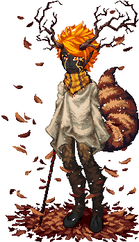
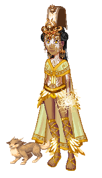
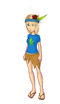
| I am looking to gather feedback on the new avatar page. If you have any please post it here. :]
Also be sure to post any problems you have with it..
And before anyone brings it up: The brown and white will be a major part of the new layout, so the avatar page won't be the only place you'll find those colors once the new layout is released. ^^
And also, I'm trying to fix the tab navigation so you will only have to sort through 7 tabs instead of 50. (I ran into a little problem with this but I hope to have it fixed soon!)
Thanks.
| |
|
|
|
|
|
|

|
|
|
|
|
DistortedBrwain
|
|
Posted: Sat Jun 06, 2009 10:52 am
|
|
|
|
| I like the brown, it is soft on the eyes. ^^
And yeah there are many tabs but I sorta like that cuz it keeps the invo organised. ^^
| |
|
|
|
|
|
|
|
|
Chere and Rose
|
|
Posted: Sat Jun 06, 2009 11:26 am
|
|
|
|
| I l;ike it alot.
The brown is really nice with the green.
And except for the many tabs like you said, it's a lot easier to use.
| |
|
|
|
_________________
*insert something witty here*
Boredom Chat <<Page Contest
|
|
|
|
|
|
MelancholyMelody~
|
|
Posted: Sat Jun 06, 2009 12:59 pm
|
|
|
|
| Very nice. It's well organised and looks very pretty.
Only thing is that all the tabs stretch the page. 
Is there any way that there could be multiple lines for them? I noticed the area they're in has a little vertical scroller, so maybe it would work?
If not it's not a biggie, though. I'm pretty cool with it the way it is. 
| |
|
|
|
_________________
Hey guys, as you may have noticed I'm currently not too active due to busyness, however if you need anything or just wanna drop me a line feel free to PM me, as when I check back I'm more likely to see it than posts. :3
iluglimpse  |
|
|
|
|
|
Chu
Assistant Admin
|
|
Posted: Sat Jun 06, 2009 2:12 pm
|
|
|
|
| Don't tell me IE is having problems with this again.
SCREENSHOT
Aside from this and the layers problem, I think incorperating some blue into it would be good. Maybe the best place to put it would be the un-equip all button, or a border around the items/layers. Nice work!
| |
|
|
|
_________________
Add me on Skype! I'm ewitsChu. Even if we've never talked, just tell me your username in the friend request and I'll accept.
 |
|
|
|
|
|
MelancholyMelody~
|
|
Posted: Sat Jun 06, 2009 2:32 pm
|
|
|
|
|
Ah, yes, it's appearing like this now for me.
Maybe I didn't give it enough time before to load fully or it just needed a refresh.
Well, whatever it was everything's swell now, and looking very nice~
I agree with the blue border idea, it would make it blend nicely with everything.
| |
|
|
|
_________________
Hey guys, as you may have noticed I'm currently not too active due to busyness, however if you need anything or just wanna drop me a line feel free to PM me, as when I check back I'm more likely to see it than posts. :3
iluglimpse |
|
|
|
|
|
Catghost
Administrator
|
|
Posted: Sat Jun 06, 2009 3:05 pm
|
|
|
|
|
| Chu wrote: |
Don't tell me IE is having problems with this again.
SCREENSHOT
Aside from this and the layers problem, I think incorperating some blue into it would be good. Maybe the best place to put it would be the un-equip all button, or a border around the items/layers. Nice work! |
*hiss*
IE is evil...
It hates margins I guess. *goes off to fix it*
And I'll see what I can do. :3 Maybe make the tab links blue and stuff. ^^
| |
|
|
|
|
|
|
|
|
HenceForth
|
|
Posted: Sat Jun 06, 2009 4:35 pm
|
|
|
|
| I'm sorry to say that I hate it. The tabs are annoying as all heck, and the brown dosn't match at all with the layout
| |
|
|
|
|
|
|
|
|
Catghost
Administrator
|
|
Posted: Sat Jun 06, 2009 5:39 pm
|
|
|
|
| Umm.. did you read the first post..?
| |
|
|
|
|
|
|
|
|
Nikki
|
|
Posted: Sat Jun 06, 2009 8:36 pm
|
|
|
|
|
Anyone who uses internet explorer should be shot on site, honestly.
But anyway - Good job Cat! I'm liking how it's looking so far. I'll definately report anything funny as it comes around.
....
EARS. Make them unequipt with the head dress on the accessories layer. D< OR move the ears down to well.. where the ears belong. >>

| |
|
|
|
|
|
|
|
|
linkfreak131
|
|
Posted: Sat Jun 06, 2009 8:59 pm
|
|
|
|
| I think the only issue I have with it is that the two buttons underneath the avatar blend in too much with the background; they should definitely stand out more. 
| |
|
|
|
|
|
|
|
|
Nikki
|
|
Posted: Sat Jun 06, 2009 9:57 pm
|
|
|
|
|
| Catghost wrote: |
And before anyone brings it up: The brown and white will be a major part of the new layout, so the avatar page won't be the only place you'll find those colors once the new layout is released. ^^ |
Cat, you should prolly put that in Bold so people don't skip over it so much. >>;
| |
|
|
|
|
|
|
|
|
glimpse
|
|
Posted: Sat Jun 06, 2009 10:05 pm
|
|
|
|
| When I saw this topic I was like, "What are these people talking about?"
Then I actually shut up and went to the avatar page. My reaction was basically "HOSHITS". With LOVE. And the only thing that I'd complain about you're already planning on fixing so I'm very PLEASANTLY SURPRISED.
| |
|
|
|
_________________
ILU MEL
Wondering why I'm
NAKED???

Check back after the event for
The First Ever Naked Day Celebration! |
|
|
|
|
|
kaishi
Artist

|
|
Posted: Sat Jun 06, 2009 11:36 pm
|
|
|
|
| Much love! I like this layout better than the old one, definitely. I'm sure it will be wonderful when there are proper tabs. (also thanks for fixing the layering with the headdress <333 )
| |
|
|
|
|
|
|
|
|