Tieru
|
 Posted: Sat Apr 11, 2009 6:56 pm Posted: Sat Apr 11, 2009 6:56 pm
|

|
|
|
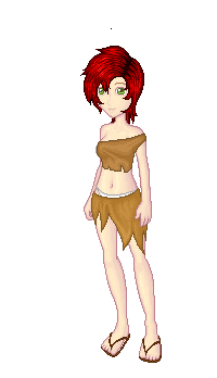
| I was wondering if I could get any good critiques on some of my pictures. If you want to critique though, you have to have an explanation as to why you think so. Something like "I think you need to make his eyes smaller because he looks older" or "You might need to practice male chests becuase this guy's is a little flat and out of proportion of a regular guy's chest". Not too hard, yes?
Here are some of my things I would like critisism before I finish them (aka they are W.I.P, and I would like a critique now before I've already colored)-
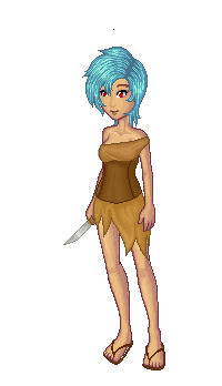
http://i102.photobucket.com/albums/m113/antipuppetkiller/Save0006-1.png
I'm not crazy about his chest. I started coloring it, which is the next picture.
http://i102.photobucket.com/albums/m113/antipuppetkiller/Save0006c.png
I need help with coloring too OTL
| |
|
|
|
|
|
|

|
heyy13
|
|
Posted: Sat Apr 11, 2009 9:28 pm
|
|
|
|
| He's supposed to be prepubecent right?
Because honestly i really like your style and don't see any obvious faults with the lines. The colouring is only at a really early stage so i can't really comment on that. : )
| |
|
|
|
_________________

By Kaishi who is just the love. Seriously. <3 |
|
|
|
|
|
Tieru
|
|
Posted: Sat Apr 11, 2009 11:30 pm
|
|
|
|
| Well, he's supposed to look young but he's really not; it's kinda dificult to explain his age, seeing as he's a personified country, but whatever |D;;
Thanks! I'll try to finish it soon!
| |
|
|
|
|
|
|
|
|
ChelseaKF
|
|
Posted: Sun Apr 26, 2009 11:19 pm
|
|
|
|
| It looks very good so far! be careful though that you don't make the figure completely rectangular! Yes, guys don't have curve but they still have a bit of a shape! When you color the torso make sure you give a lot of shadow under by the shirt area to help avoid making him look completely flat!
| |
|
|
|
|
|
|
|
|
Tieru
|
|
Posted: Mon Apr 27, 2009 6:49 am
|
|
|
|
| Oh! Thank you .gif)
I never thought of that.
| |
|
|
|
|
|
|
|
|
Bliss
|
|
Posted: Sun Jan 03, 2010 1:03 am
|
|
|
|
| I must say, I love the crab...
Does it have any underlying meaning? Or is it just a cute little mascot-esque crab?
If I had to point out anything, it would probably be his right hand. I just tried doing it with my own, and it had to be forced, y'know? He just looks so carefree, and the tense, unnatural position of his hand threw me there for a second.
Other than that, it's really good  Kudos!~ Kudos!~
| |
|
|
|
|
|
|
|
|
VampMiyu
|
|
Posted: Thu Jan 07, 2010 7:34 pm
|
|
|
|
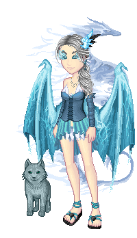
| I love it! what tool are you using for the colouring? it's really gppd! I don't see anything to criticise either
| |
|
|
|
|
|
|
|
|
ikittycat
|
|
Posted: Wed Jan 27, 2010 7:11 pm
|
|
|
|
| ♥♥♥♥
Wow, I really love the facial expression.
It has so much emotion.
I like this.
Could use more detail maybe?
But if anything it looks great!
♥♥♥♥
| |
|
|
|
_________________
I Totally Love What's His Name. ♥ |
|
|
|
|
|
NeoDarklight
|
|
Posted: Mon Feb 22, 2010 4:00 pm
|
|
|
|
| The mouth looks slightly lopsided, the cross part of the necklace looks uneven, the coat has too many buttons and button holes, and the hands just look plain unnatural for the drawing style. Other than that, it's great! Wish I had more to say, but I don't.
| |
|
|
|
_________________
To make the distinction between Good and Evil, you must first define them. |
|
|
|
|
|
AgataBr
|
|
Posted: Fri Apr 16, 2010 2:04 pm
|
|
|
|
| Wah!Is very cute s2 i like >w< 
| |
|
|
|
|
|
|
|
|
killerkitty
Moderator

|
|
Posted: Thu Apr 22, 2010 3:27 pm
|
|
|
|
| ooh nice!! um, how did you get the color to go behind the lines?
| |
|
|
|
_________________
They/Them
O shucks what's up buddy |
|
|
|
|
|
Kylana
|
|
Posted: Sat May 08, 2010 11:16 am
|
|
|
|
| Killerkitty, that's usually done by having the lines on a separate layer above the coloring layer (which is nice because you can change the line color very easily if you don't want harsh black lines). You can also set the lines layer to "Multiply" (assuming you're using Photoshop or some other program that lets you do that) and then make a layer beneath the lines to color on.
| |
|
|
|
|
|
|
|
|